
Case study
PROMED
Professional Medical Management
Brand strategy · Identity · Environmental · Digital
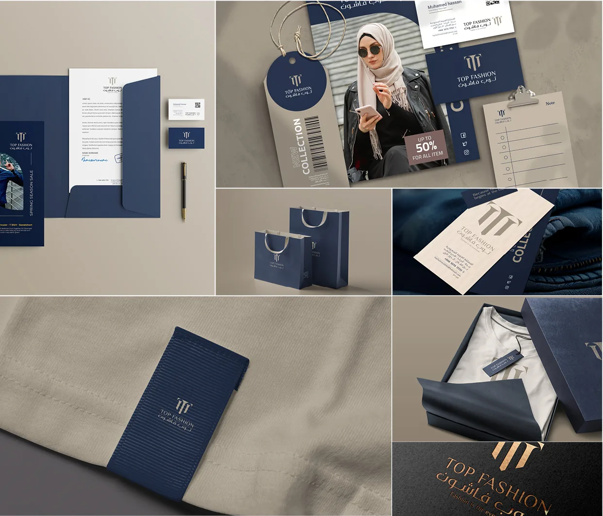
Healthcare branding defaults to reassurance: soft blues, smiling stock, a rounded logotype. PROMED manages medical operations for other providers. Its buyers are administrators, not patients — and administrators do not buy comfort.
The work
- 01
Interviews before ideas
Eleven conversations with hospital administrators. The word that recurred was not care. It was accountability.
- 02
A mark that measures
The diamond is a measurement figure, not a cross. Four facets, one centre — the shape a report takes when the numbers agree.
- 03
Two scripts, one voice
Arabic and Latin drawn to the same weight and rhythm, so neither reads as the translation of the other.
- 04
Built for the corridor
Every asset was tested at three metres on a wall before it was approved on a screen.
We stopped explaining what we do the week the new identity went up.
- 11
- stakeholder interviews
- 2
- scripts, one system
- 3m
- legibility target
- 14
- weeks end to end
What changed
The sales deck stopped opening with an explanation of the company and started opening with the work.
What did not
The teal. It was already theirs, already recognised in the sector, and replacing it would have cost more than it bought.